Friday, April 10, 2015

Vue project 1015

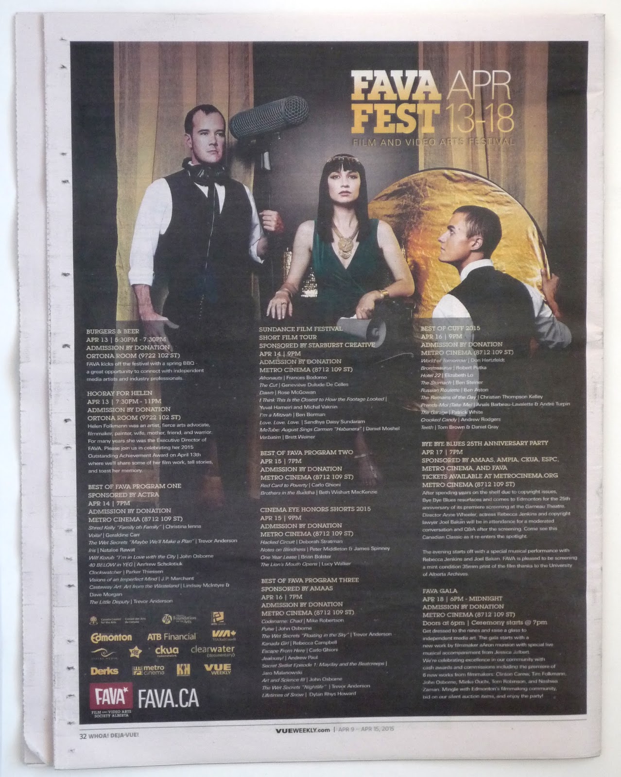
Vue is apparently a promotional sponsor of the Film and Video Arts Film Fest, so they have access to this very nice promotional photo.


The only problem is that the same photo (great as it is) is used for the inside article . . .


. . . and again for the advertisement on the back of the issue. (Even the person writing the folio comment for the back page knows that this is a bit much. The folio reads, "Whoa! Deja-Vue!")


So, I decided to do something different. The award for this film festival is Werner Herzog's boot. As explained in the the story, Herzog was the guest of an Edmonton film festival in the 1990s. He gave his hosts the gift of a pair of old boots -- representing the hardscrabble do-it-yourself determination that it takes to make independent film. Kinda fun when you also recall the Les Blank movie, "Werner Herzog Eats His Shoe." The winners are awarded an old boot and a cash prize. So, I went with a boot.


I put an asterisk at the end of the headline and some little bitty type at the bottom reads, "*It's actually Werner Herzog's boot. It's a whole thing. We explain it all inside."

Just to be contrary, I made all the type Helvetica.


Vue project 1014

The photo is nice, the models are cute, the type treatment is fine. I particularly like the green and black logo just tossed up there to fend for itself on the slightly busy background. This is a good cover.


Friday, March 27, 2015

Vue project 1013

I've been letting the covers slide for a couple weeks, but this one jolted me back into action.

What do you do when you get a horizontal picture for use on a vertical cover?

• You can do a couple things. Using Photoshop, you can clone an element of the picture to add height. In this case, you could make that grass a much larger area.

• You can leave it horizontal and use the space for type. Lots and lots of type. (That's the approach the designer has taken here.)

• You can (depending on how much leeway you have for photo abuse) (hey, it's handout art of a band, there has to be leeway) stretch that thing to make it fill a more reasonable amount of space. (That's what I did.)


And, I rewrote the headlines. I think my "Oh, Snap" headline is perhaps too flip for the subject of the stories inside (war photography, funeral photography) but I can't resist a snotty headline.

For the flag this week, I'm using Nick Shinn's Beaufort. For the headline type it's the old reliable, Rockwell.

And -- white space.


Vue project 1012

I like the moose antlers as a wine glass shape.

Three fonts for the headline of four words may be overdoing it.

I don't think the background of this drawing helps. Maybe if the people in the background were moose I'd like it better.

I like the color choices quite a bit. These colors really compliment the illustration's colors.


Vue project 1011

I think this cover is fine. The photo is great, and it leaves a lot of space at the top for the headline stuff. The green of the headline and yellow of the logo don't have much to do with the coloring of the photo. I'd probably try to pick some colors that are more complimentary -- or just go with white or gray. The "Vigilante" type treatment may be a little over-fussy, but it's okay.


Wednesday, March 25, 2015

Edmonton Metro's new look

Edmonton's free daily newspaper got a new look today.

Here are some pages, comparing last Friday's to today's edition.

Moving from dark green to bright green. Also changing display typefaces (I think the text type remains the same).

Here are my guesses at to what's being used for fonts. Headline font: Lyon Display from Commercial Type. Metro logo and secondary display font: I was going to guess Helvetica, but that's not it. This font has a round dot for the period. I'm stumped. Looks like one of the sans fonts Entertainment Weekly is using right now. [Update: The typeface is Graphik -- also from Commercial Type. Thank you, Mark Simonson.]

Also: A different ad configuration on the top of the front page.


Gone are the flipped one-column section headers. That's probably for the best. I think it was a little awkward going down the side of the page -- just to abruptly end at the bottom advertisement. 

I was not a fan of the gradients going on in section heads -- though I didn't mind it on the front page logo. 

The refurbished Metro logo gets big play (although making it white on a light gray background downplays the big play).


Interior pages carry through the brighter look. Note the folio has gone from dark green and gray to all bright green. The folio color now changes with the sections. The previous design kept the green/gray folios throughout.

The new pages may be slightly narrower on the trim, but the image size seems to be the same.


Features cover reworked. Purple rather than gold? Yes!


An interior features spread. Using the bold headline type exclusively right now. I'm guessing that may change with time.


Sports front page. Red for sports. 


Sunday, March 08, 2015

Inspired by Saul Bass

The wonderful 1955 movie poster for "Man with the Golden Arm" by Saul Bass has inspired many knock-offs. (Here's a great blog post showing the range of original Saul Bass posters for this movie. And another nice posting about how Saul Bass designs are mostly ignored by modern-day DVD cover designers.)

Here's the original. (As always, click for an enlarged view.)


And a lobby card version from the same time.


And a poster I spotted on the street last week.


And a design I did in 1996. I should've paid more attention to the lettering on the original, but this was pre-internet and I was working from memory. I should have also just worked in black plus one color. Making the hand in color is overkill.


And the inside layout -- which benefits from being restricted to just black and white.


Friday, March 06, 2015

Vue project 1010

Thought the original cover was nice. It's using some white space -- which I always like. The addition of the paint brush struck me as not needed, but overall, the original cover works.

But I wanted to push it a little further. I know nothing about horses. But after some thought, I remembered the Edward Muybridge horse study photos. Found a set of those photos on the Internet, converted it to silhouette, and I had an instant herd of the beasts.

I was also inspired by this month's (March 2015) National Geographic cover story opening spread on science skeptics. 


Headlines this week are Bitstream's version of Antique Olive named Incised 901. Logo is made from Monotype Bell. I decided to do a unicase thing with the "E" letters just to mix it up a bit -- because, you may have noticed, Vue Weekly has a lot of "E"s. Those lower-case "E"s kinda start to look like eyes.


Although one of the main players in the story is named WHOAS (Wild Horses of Alberta Society), I decided to blunder ahead with "WHOA" as the main headline. It's short, it's punchy, it's horsey -- and I cannot resist a "Matrix" reference.

Saturday, February 28, 2015

Vue project 1009

I like the original cover this week. The drawing, by Jill Stanton, is fun and gets across the subject matter. The logo looks great just knocked out of that black background.

I think the only place for improvement is the traffic jam of type at the bottom. The changing of the background for the K-Cup headline is a good start. Perhaps the bottom headlines could be on a different color background, too. On my redesign, I've tweeked the color on the main headline, but I like the original treatment quite a bit.

My logo is in Avenir Condensed. It's really the current Vue logo with a different typeface and the contrast between bold and light cranked up some more.


Sunday, February 22, 2015

Vue project 1008

Another pretty nice publicity shot. I decided to put it on pure white (of course) play with the shadow a little bit. The original cover has the right idea, but I don't think the design gets there.

An additional element in the mix with the "Pedway Dungeon Crawl" highlighted. The way it's treated on the original covert really fights with the dancer image. I separated them a little more both in space and by color treatment -- hopefully keeping the emphasis on the main image.

Both I and the original cover designer reworked the actual Pedway sign. We both interpreted "Dungeon." The designer of the original cover added Converse Hi Tops and monster feet. I made the Pedway logo's pants a little more ragged.

Logo using another of my favorite fonts, Dom.


What the actual Ped Way street sign looks like:


Update: I've put a more realistic newsprint background on my design.


Vue project 1007

The color of the newsprint is your friend.

A great publicity photo to work with. I put the subject on a white background. To give the photo more punch, I downplayed the headline and logo type.

Hey, it says "Diva" and "Full Frontal" right there in the headline, so I put a tint on the subject's lips and nipples. I'm playing along. I also made the black and white photo just black -- no four-color tint. It's sharper that way and the red tint jumps out better.

(I took the original photo off the Vue Weekly website, so my mock-up pops more than usual.)

This logo treatment is very plain. But I think it could work.


 Update: I've put a more realistic newsprint background on my design.


Vue project 1006

To illustrate this cover headline, I like the idea that the original designer came up with: Showing different races in small segments. But I'd do it differently. Perhaps closeups of different hair types (maybe not). Or different skin complexions (maybe not). Or how about eyes -- since beauty is in the eye of the beholder. Or something.

My illustration could use a little polish, but I think the eye thing is working pretty well with the headline.

The logo is lifted from another, very well-designed logo -- Variety. Hey, they really make the "V" sing out.


Update: I've put a more realistic newsprint background on my design.


Vue project 1005

I liked this cover. I wouldn't do anything to change it.

Nice job dressing up the provided photo. And I like the type treatment, too. It's all a little bit everything and the kitchen sink, but I think it works.

I didn't collect one off the newsstand, so I have no photo of the original issue.


Vue project 1004

"Death from Above 1979" is a powerful name for a band. And the elephant nose thing that they use for their logo is a pretty powerful image.

Again, rather than dressing it up, I stripped it down to what I see as the essence. I just used the logo. "Death" really big in a headline is a grabber, so I grabbed.

Using Knockout and Univers for the headline treatment.

Going a little nuts with emphasising the "V" in Vue. It's a very similar treatment to the one that is used on the real publication. Univers and everything.


Update: I've put a more realistic newsprint background on my design.


Vue project 1003

Using provided photography can be a pain in the neck. Sometimes you just have to use it and go on. I think the designer did a fine job here, but the subhead and the headlines at the bottom are in conflict. The original designer dealt with it by putting the main head and subhead on a slant. I separated the education head completely -- made it look like a special section or something special.

As for the logo, it's another kind of retro look. The typeface is Ribbon and it could not look more 1950s. I like it.

Also upped the sepia tone on the photo and used cowboy-ish type for the headline treatment.


Update: I've put a more realistic newsprint background on my design.


Vue project 1002

Getting into Rockwell type on this one.

And simplifying again. Well -- that's my schtick.

Can't go wrong with an International No Symbol. Thought the symbol was strong enough to not use a headline and just go for a subhead.

Swiped a photo off the Internet for the bread. Don't know what kind of photography budget there is for Vue Weekly, but I'd hope there would be a couple dollars to cover a stock photo.

Going big for the white space. I maintain that white is the best color for most of a printed cover. It's the brightest color you can get, so I might as well use it.


Update: I've put a more realistic newsprint background on my design.


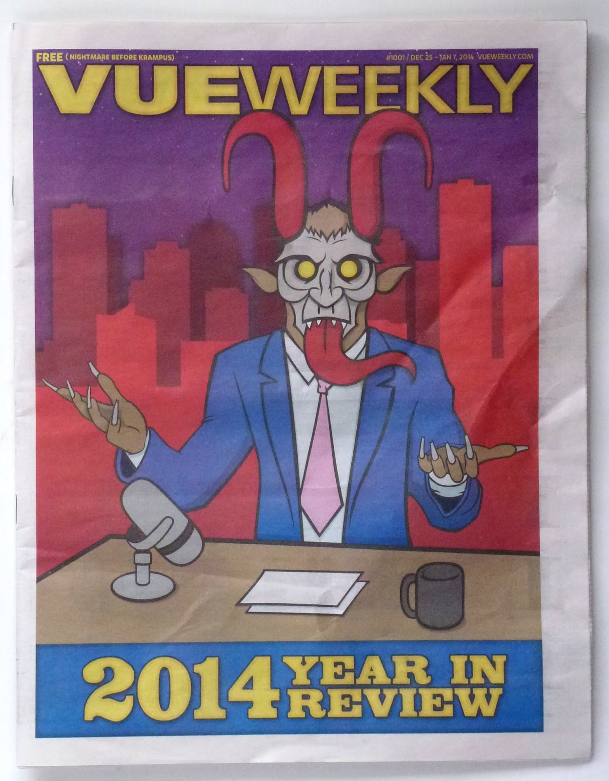
Vue project 1001

"Year in Review" issue for some reason features Krampus.

Okay -- I'll just go with it.

Not sure about the late-night host/Krampus combo, so I just made it focus on Krampus alone.

Kinda liking this logo. The type is so big it almost doesn't read as a word.


Update: I've put a more realistic newsprint background on my design.


Saturday, February 21, 2015

Vue project 1000

By reworking the covers of a local publication, I admit I'm being a bit of a jerk.

But I have this urge to design some stuff. So, off I go. These designs are for educational purposes only.

The logo of the Vue Weekly presents some serious design challenges. Just three letters in the main part of the logo (VUE). And they are difficult letters. On this one I go sliding into the retro-rounded letters. Every letter has a curve -- except for the "V." Sorta works.

The current covers are all staff illustrated, with some publicity photos tossed in. Having to do the paper and do the cover illustration at the same time? That's a heavy load.

I really liked the unicorn in the original illustration so I took made it the star of the cover, And I rewrote the headline to play up the rarity of the one thousand mark -- and the unicorn. With a possibly obscure reference to "The Outsiders" that maybe no one will get.


Update: I've put a more realistic newsprint background on my design.


Wednesday, December 03, 2014

Blondie/Penguins

Submitted without comment.


Monday, December 01, 2014

Forever isn't what it used to be

You say "Permanent" and I say "Forever." Let's call the whole thing off.

Business is slow for the people who hand-deliver personal letters and bill payments. But the postal services of the world (okay, United States, Canada and the United Kingdom) have come up with a way to encourage people to buy postage stamps to make mailing letters less annoying.

Since postage rates are going up on a seemingly yearly basis, postal services now sell stamps that don't have a price on them (called, according to Wikipedia, "Non-Denominated Postage"). The stamps are good for first class letters now and into the future, even if postage rates increase after the stamp was purchased.

In the U.S. they are called Forever stamps, in Canada they're called Permanent stamps, in the U.K. they are simply called First Class stamps. And there's not a price on any of them.

And while I think the idea is good I think some of the executions of the idea are better than others.

The United Kingdom has opted to print "1st" on every stamp. That, in combination with the Queen's silhouette, is all there needs to be on a U.K. stamp. The U.K. doesn't even print the name of the country on the postage. That's confidence.


The United States puts the entire word "Forever" on every stamp. Along with the letters USA. And sometimes the name of whatever is on the stamp. I gotta say I think it gets a little crowded on the U.S. stamps.


Canada's stamps have a very small "P" inside a maple leaf on their stamps. Along with that symbol, stamps must always say, "Canada." (Not to mention the English/French language thing.) The word "Canada" is a bit of a longer word than "USA," so it's for the best that Canada decided against spelling out "Permanent."


A few more examples:

I think the U.K.'s solution is pretty cool. Just having the silhouette and three characters on a stamp can really open up the small space for some fun stuff. And while the silhouette doesn't always work with the subject matter on the stamp, it's generic enough to eventually blend in and be ignored.


A very standard treatment here. The info is there, but it doesn't compete with the artwork.


And when the Queen profile is the main image on the stamp -- then it's the most simple a stamp can be. Clean and classy.

Canada's solution is pretty flexible. The three elements of Permanent logo, country and subject matter label allows for some fun designs.


Again with the unnamed Queen.


This Chinese New Year stamp downplays the symbol. (The English word "Dragon" must be "Dragon" in French, too.)


Lotsa logos here, but the Permanent logo doesn't clash. (Zamboni postage!)


More type on this stamp than most -- including the guy's jersey number. The Permanent logo again, doesn't clash.


The Permanent logo on this one is really downplayed. Because of its size and coloring, it's almost just another letter in the word, "Canada." (Canada and the U.K. have no problem putting living people on stamps. It's a bit of a shock to a born and raised U.S. stamp fan.)


While the U.K. and Canada opt for compact solutions, the United States "Forever" is big and bold and -- sometimes -- a bit much. Putting a label of "Forever" on something implies immortality or invincibility. That can be overbearing. These flag designs, for example.
With the Reagan stamp, the "Forever" is downplayed -- and that's good, in my opinion. Still, the "Forever" hints at the eternal.


The Janis stamp plays up the immortality angle.


The Jimi stamp just lets it kinda fade away into the background.


"Batman / Forever / USA." The "Forever" is getting pretty big play here. Batman forever? Yes, if Warner Bros. has anything to say about it.