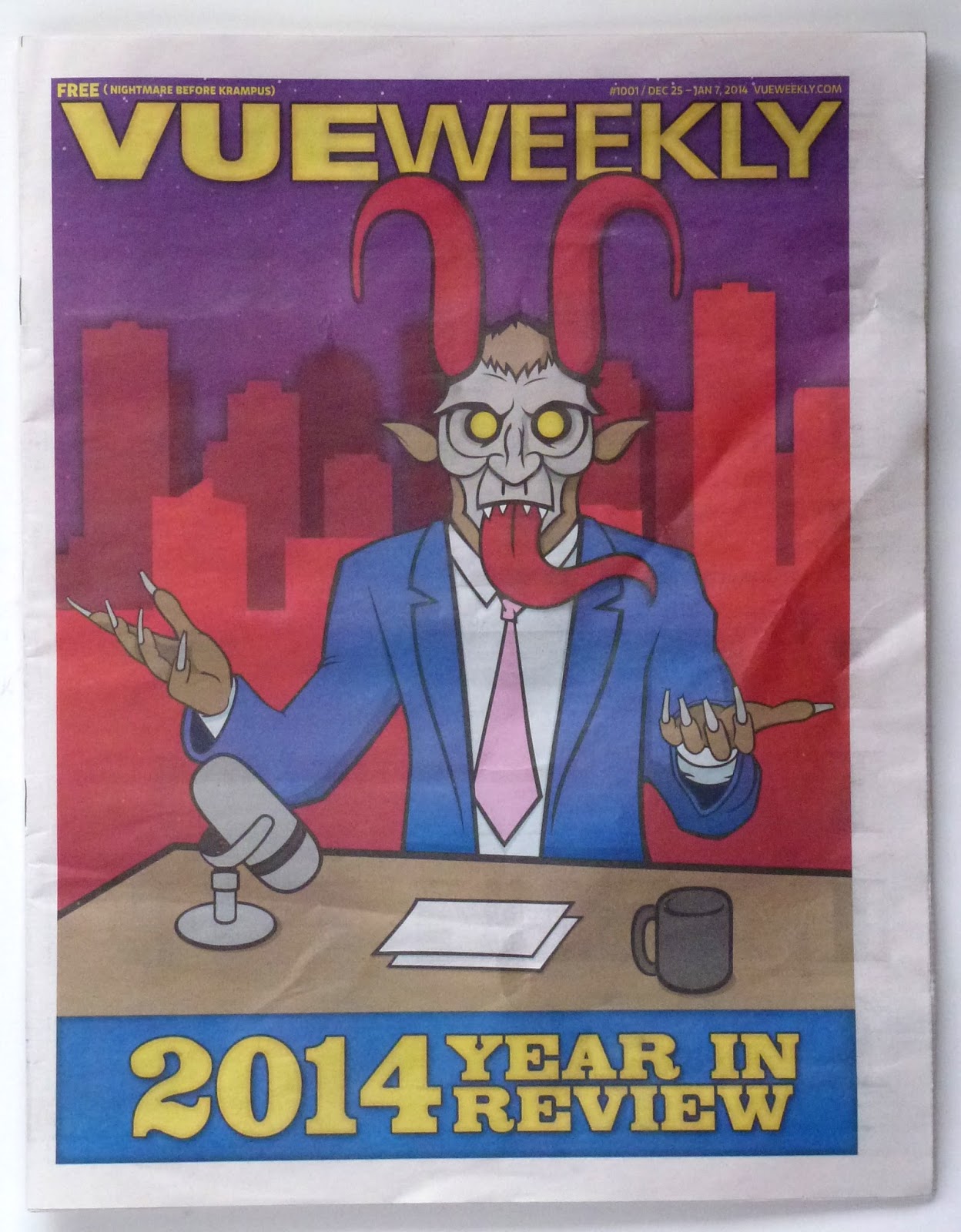
"Year in Review" issue for some reason features Krampus.
Okay -- I'll just go with it.
Not sure about the late-night host/Krampus combo, so I just made it focus on Krampus alone.
Kinda liking this logo. The type is so big it almost doesn't read as a word.
Update: I've put a more realistic newsprint background on my design.


No comments:
Post a Comment