A couple weeks ago, Canada legalized recreational use of cannabis. I eagerly awaited the cover of the alternative weekly in town, 'cause they seem to have a bit of a cannabis fixation. I was pretty sure they'd commemorate the event somehow. Vue Weekly did not disappoint.
While I think the headline is funny, I don't think the illustration delivers on the joke. I think the illo is fine and it would work with another headline, but this headline needs a different kind of treatment.
Here's my version. I almost think it would work better without the leaf in the background, but hey -- you gotta give the readers something to hold on to.
Showing posts with label Vue project. Show all posts
Sunday, November 04, 2018
Tuesday, May 15, 2018
Vue project 1176
I've cut back on my Vue Weekly obsession -- at least I've cut back on blogging about it. But every once in a while, a cover comes along that I have to dig into. Not to disparage the original, but to challenge myself to see if I can come up with my own spin on it.
This cover caught my eye because the designer actually changed the logo to match the concept of the art. I thought that was pretty cool.
And then the rest of the type is also in "computer" type. A worthy effort. But I felt the illustrations really let down the concept. If you are going to go with big pixels, I say embrace the big pixels. I was particularly disappointed with the keyboard illustration which looks more like generic clip art than pixel art. I like the little faces and the guitars -- because they seem to be close to the same size of pixel-ratio. The drum set is too complex for this pixel size.
So … I redid the cover using all the same pixel size. (Except for the secondary type, which I just did in type.) That meant simplifying the people into just faces and dropping the instruments altogether -- because the pixel size of the type wouldn't allow that much detail. I plopped in the notes to suggest music and left it at that.
I concentrated mostly on the pixel type. That was fun.
This cover caught my eye because the designer actually changed the logo to match the concept of the art. I thought that was pretty cool.
And then the rest of the type is also in "computer" type. A worthy effort. But I felt the illustrations really let down the concept. If you are going to go with big pixels, I say embrace the big pixels. I was particularly disappointed with the keyboard illustration which looks more like generic clip art than pixel art. I like the little faces and the guitars -- because they seem to be close to the same size of pixel-ratio. The drum set is too complex for this pixel size.
So … I redid the cover using all the same pixel size. (Except for the secondary type, which I just did in type.) That meant simplifying the people into just faces and dropping the instruments altogether -- because the pixel size of the type wouldn't allow that much detail. I plopped in the notes to suggest music and left it at that.
I concentrated mostly on the pixel type. That was fun.
Wednesday, January 06, 2016
Vue project #1051 Krampus edition
Last year at this time I was hard on Vue Weekly's 2014 Year In Review cover. I thought it was obscure. And I wanted more emphasis on the Krampus character and less on the talk show format.
But I've changed my mind on it because, as this week's cover makes clear, last year's effort was one in a series of Year in Review covers featuring a Krampus character. And seeing this year's Krampus cover makes me feel better retrospectively about last year's cover.
That said, there are definitely some improvements in this year's cover. I like the type treatment integrated with the illustration. I like the "Krampus" name tag on the bowling shirt. I like that the character is solidly put across by showing the hooves and tail. Plus, the pose is dynamic. The colors are well chosen and the white logo pops out of the page.
A quick search of vueweekly.com shows me that the Krampus Year In Review covers started (probably) with the 2013 Review. Here's a screenshot of that cover:
But I've changed my mind on it because, as this week's cover makes clear, last year's effort was one in a series of Year in Review covers featuring a Krampus character. And seeing this year's Krampus cover makes me feel better retrospectively about last year's cover.
That said, there are definitely some improvements in this year's cover. I like the type treatment integrated with the illustration. I like the "Krampus" name tag on the bowling shirt. I like that the character is solidly put across by showing the hooves and tail. Plus, the pose is dynamic. The colors are well chosen and the white logo pops out of the page.
A quick search of vueweekly.com shows me that the Krampus Year In Review covers started (probably) with the 2013 Review. Here's a screenshot of that cover:
Friday, December 04, 2015
Vue project 1049
Saw this week's cover and thought it should be more fun. The subject matter is off putting, but fun in an alternative-weekly way. Parts of a horse that make a horse: horseshoes, horse neck, horse legs, horse tail, horse nose. Parts of horse on view in this illustration: horse legs, horse tail and horseshoes. But the hand and the sandwich kinda take over this illustration.
I thought I'd tighten up the headline a bit and put the whole horse on display. And believe it or not there are horse meat butcher charts much like this available for view on the internet. I constructed my own, so the all-Cheltenham type would make a unified cover.
Logo this time: Antique Olive condensed bold lowercase with a few alterations.
I thought I'd tighten up the headline a bit and put the whole horse on display. And believe it or not there are horse meat butcher charts much like this available for view on the internet. I constructed my own, so the all-Cheltenham type would make a unified cover.
Logo this time: Antique Olive condensed bold lowercase with a few alterations.
Tuesday, November 24, 2015
Vue project 1047
Vue Weekly introduced a new section this week. Named, "Pop." When I hear the word "Pop," my brain jumps to Pop Art. Specifically the work of Andy Warhol (high contrast silkscreen images) and Roy Lichtenstein (the guy who did the versions of comics with the black lines and the big dots) come to mind. One other thing that this cover brought to mind is the Batman television sound effects lettering onscreen. Particularly the one reading "KaPow!"
![]() |
| Photo credit: http://quotesgram.com/boy-wonder-robin-holy-quotes/ |
Here's the original Vue Weekly cover. I like the bright colors of the type and the large, white "Pop!" really pops out of the background color. Didn't like the cryptic, unlabeled photos connected with a blend. What are the two photos about? Are they from the same pop culture niche?
I took all that and made my own version of this cover. Reducing the art to high contrast black and white made it easy to combine the two separate images into one -- taking some care to make the people the same size. But then I labeled the two separate things so the reader knows there are two subjects. Perhaps they are combined into one article, perhaps not. Logo is Gill Sans with mutated letters for "e" and "k."
Friday, October 23, 2015
Vue project 1043
Canada's latest national election just ended. Justin Trudeau is now the Prime Minister of Canada. It's a big switch. It's big news. So all the newspapers are making a fuss.
Here's how the Vue Weekly did it.
I like the National Enquirer vibe of this original cover. I like covers that have a lot of headlines on them. Looks newsy. But I thought it could been taken further. So I did this version.
Here's how the Vue Weekly did it.
I like the National Enquirer vibe of this original cover. I like covers that have a lot of headlines on them. Looks newsy. But I thought it could been taken further. So I did this version.
Friday, August 07, 2015
Vue project 1032
I like the Schwinn Sting Ray. When I was a kid, my dad told me I couldn't have one because the wheels were too small and the wheels would wear out faster than big wheels. But I still wanted one. And I still kinda do.
This week's issue of Vue Weekly features the Death Spoke Bicycle Club -- which despite its scary name, has a large percentage of Sting Ray riders. The published cover is actually very nice. The colors are strong and simple. The type is pretty cool. And I like the headline.
But when I read the story inside, Sting Ray bikes are mentioned in the first paragraph! And I liked the inside headline better: "Swell on Two Wheels." So I thought I'd shorten that headline for the redo, and also include an image of that iconic bike (stolen from the internet). I just couldn't help it, Dad.
This week's reworked logo is Franklin Gothic, with a couple twists.
This week's issue of Vue Weekly features the Death Spoke Bicycle Club -- which despite its scary name, has a large percentage of Sting Ray riders. The published cover is actually very nice. The colors are strong and simple. The type is pretty cool. And I like the headline.
But when I read the story inside, Sting Ray bikes are mentioned in the first paragraph! And I liked the inside headline better: "Swell on Two Wheels." So I thought I'd shorten that headline for the redo, and also include an image of that iconic bike (stolen from the internet). I just couldn't help it, Dad.
This week's reworked logo is Franklin Gothic, with a couple twists.
Tuesday, July 28, 2015
Vue project 1030
Nice cover. Great image by Ivan Otis. Lots of inviting white space. A fun and furry treatment for Vue Weekly logo. Looks good.
Minor quibble: Even though there are four "A"s in the artist's name, the most interesting part of any word containing a capital "Q" -- is the capital "Q." So I'd include it in the artistic treatment of the name. Kinda like this.
Sunday, June 28, 2015
Friday, April 17, 2015
Vue project 1016
I like this week's cover. Good job all around -- art and type.
(Tiny complaint: I think the record player's tone arm should be on the right-hand side.) (I know -- picky much?)
I like the simple but powerful restricted colors. I like the display type. I particularly like the way the illustration makes its way up into the logo.
(Tiny complaint: I think the record player's tone arm should be on the right-hand side.) (I know -- picky much?)
I like the simple but powerful restricted colors. I like the display type. I particularly like the way the illustration makes its way up into the logo.
Friday, April 10, 2015
Vue project 1015
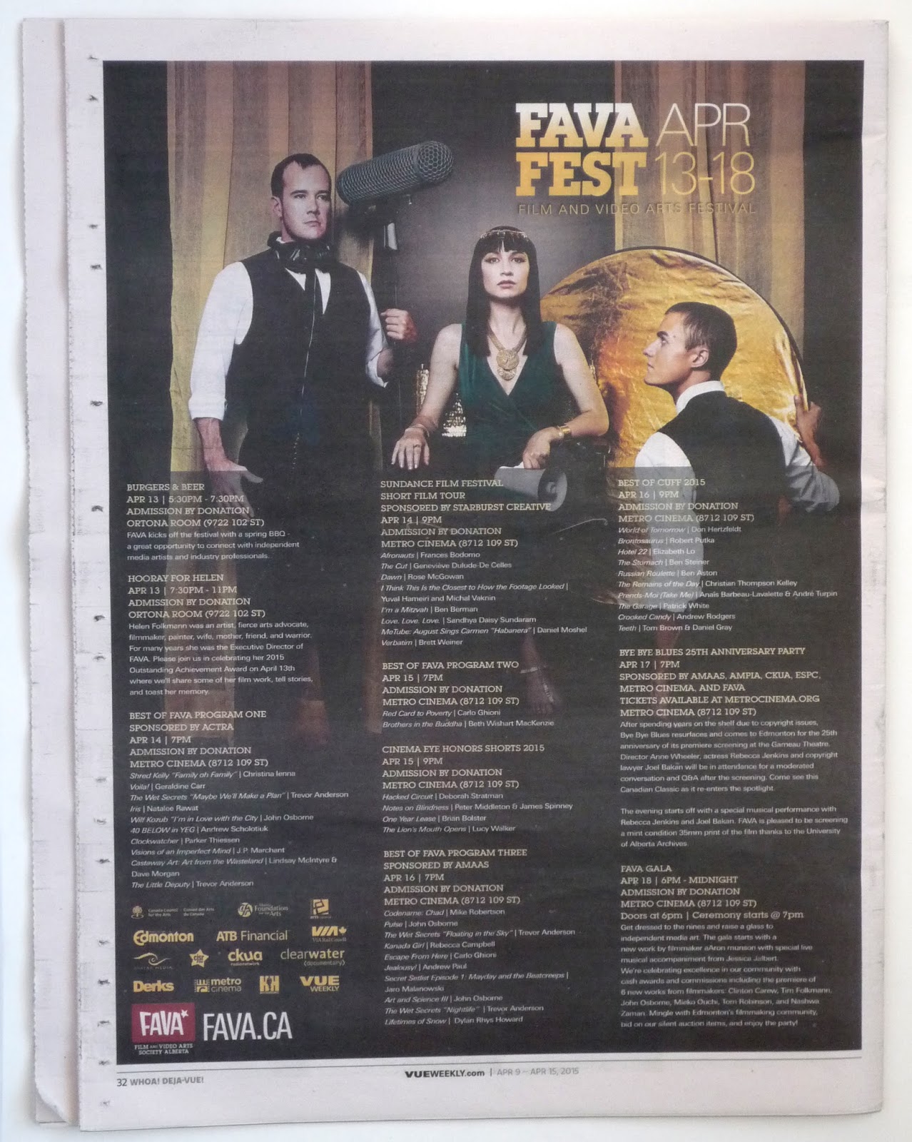
Vue is apparently a promotional sponsor of the Film and Video Arts Film Fest, so they have access to this very nice promotional photo.
The only problem is that the same photo (great as it is) is used for the inside article . . .
. . . and again for the advertisement on the back of the issue. (Even the person writing the folio comment for the back page knows that this is a bit much. The folio reads, "Whoa! Deja-Vue!")
So, I decided to do something different. The award for this film festival is Werner Herzog's boot. As explained in the the story, Herzog was the guest of an Edmonton film festival in the 1990s. He gave his hosts the gift of a pair of old boots -- representing the hardscrabble do-it-yourself determination that it takes to make independent film. Kinda fun when you also recall the Les Blank movie, "Werner Herzog Eats His Shoe." The winners are awarded an old boot and a cash prize. So, I went with a boot.
The only problem is that the same photo (great as it is) is used for the inside article . . .
So, I decided to do something different. The award for this film festival is Werner Herzog's boot. As explained in the the story, Herzog was the guest of an Edmonton film festival in the 1990s. He gave his hosts the gift of a pair of old boots -- representing the hardscrabble do-it-yourself determination that it takes to make independent film. Kinda fun when you also recall the Les Blank movie, "Werner Herzog Eats His Shoe." The winners are awarded an old boot and a cash prize. So, I went with a boot.
I put an asterisk at the end of the headline and some little bitty type at the bottom reads, "*It's actually Werner Herzog's boot. It's a whole thing. We explain it all inside."
Just to be contrary, I made all the type Helvetica.
Vue project 1014
The photo is nice, the models are cute, the type treatment is fine. I particularly like the green and black logo just tossed up there to fend for itself on the slightly busy background. This is a good cover.
Friday, March 27, 2015
Vue project 1013
I've been letting the covers slide for a couple weeks, but this one jolted me back into action.
What do you do when you get a horizontal picture for use on a vertical cover?
• You can do a couple things. Using Photoshop, you can clone an element of the picture to add height. In this case, you could make that grass a much larger area.
• You can leave it horizontal and use the space for type. Lots and lots of type. (That's the approach the designer has taken here.)
• You can (depending on how much leeway you have for photo abuse) (hey, it's handout art of a band, there has to be leeway) stretch that thing to make it fill a more reasonable amount of space. (That's what I did.)
What do you do when you get a horizontal picture for use on a vertical cover?
• You can do a couple things. Using Photoshop, you can clone an element of the picture to add height. In this case, you could make that grass a much larger area.
• You can leave it horizontal and use the space for type. Lots and lots of type. (That's the approach the designer has taken here.)
• You can (depending on how much leeway you have for photo abuse) (hey, it's handout art of a band, there has to be leeway) stretch that thing to make it fill a more reasonable amount of space. (That's what I did.)
And, I rewrote the headlines. I think my "Oh, Snap" headline is perhaps too flip for the subject of the stories inside (war photography, funeral photography) but I can't resist a snotty headline.
For the flag this week, I'm using Nick Shinn's Beaufort. For the headline type it's the old reliable, Rockwell.
And -- white space.
Vue project 1012
I like the moose antlers as a wine glass shape.
Three fonts for the headline of four words may be overdoing it.
I don't think the background of this drawing helps. Maybe if the people in the background were moose I'd like it better.
I like the color choices quite a bit. These colors really compliment the illustration's colors.
Three fonts for the headline of four words may be overdoing it.
I don't think the background of this drawing helps. Maybe if the people in the background were moose I'd like it better.
I like the color choices quite a bit. These colors really compliment the illustration's colors.
Vue project 1011
I think this cover is fine. The photo is great, and it leaves a lot of space at the top for the headline stuff. The green of the headline and yellow of the logo don't have much to do with the coloring of the photo. I'd probably try to pick some colors that are more complimentary -- or just go with white or gray. The "Vigilante" type treatment may be a little over-fussy, but it's okay.
Friday, March 06, 2015
Vue project 1010
Thought the original cover was nice. It's using some white space -- which I always like. The addition of the paint brush struck me as not needed, but overall, the original cover works.
But I wanted to push it a little further. I know nothing about horses. But after some thought, I remembered the Edward Muybridge horse study photos. Found a set of those photos on the Internet, converted it to silhouette, and I had an instant herd of the beasts.
I was also inspired by this month's (March 2015) National Geographic cover story opening spread on science skeptics.
Headlines this week are Bitstream's version of Antique Olive named Incised 901. Logo is made from Monotype Bell. I decided to do a unicase thing with the "E" letters just to mix it up a bit -- because, you may have noticed, Vue Weekly has a lot of "E"s. Those lower-case "E"s kinda start to look like eyes.
Although one of the main players in the story is named WHOAS (Wild Horses of Alberta Society), I decided to blunder ahead with "WHOA" as the main headline. It's short, it's punchy, it's horsey -- and I cannot resist a "Matrix" reference.
Saturday, February 28, 2015
Vue project 1009
I like the original cover this week. The drawing, by Jill Stanton, is fun and gets across the subject matter. The logo looks great just knocked out of that black background.
I think the only place for improvement is the traffic jam of type at the bottom. The changing of the background for the K-Cup headline is a good start. Perhaps the bottom headlines could be on a different color background, too. On my redesign, I've tweeked the color on the main headline, but I like the original treatment quite a bit.
My logo is in Avenir Condensed. It's really the current Vue logo with a different typeface and the contrast between bold and light cranked up some more.
I think the only place for improvement is the traffic jam of type at the bottom. The changing of the background for the K-Cup headline is a good start. Perhaps the bottom headlines could be on a different color background, too. On my redesign, I've tweeked the color on the main headline, but I like the original treatment quite a bit.
My logo is in Avenir Condensed. It's really the current Vue logo with a different typeface and the contrast between bold and light cranked up some more.
Sunday, February 22, 2015
Vue project 1008
Another pretty nice publicity shot. I decided to put it on pure white (of course) play with the shadow a little bit. The original cover has the right idea, but I don't think the design gets there.
An additional element in the mix with the "Pedway Dungeon Crawl" highlighted. The way it's treated on the original covert really fights with the dancer image. I separated them a little more both in space and by color treatment -- hopefully keeping the emphasis on the main image.
Both I and the original cover designer reworked the actual Pedway sign. We both interpreted "Dungeon." The designer of the original cover added Converse Hi Tops and monster feet. I made the Pedway logo's pants a little more ragged.
Logo using another of my favorite fonts, Dom.
An additional element in the mix with the "Pedway Dungeon Crawl" highlighted. The way it's treated on the original covert really fights with the dancer image. I separated them a little more both in space and by color treatment -- hopefully keeping the emphasis on the main image.
Both I and the original cover designer reworked the actual Pedway sign. We both interpreted "Dungeon." The designer of the original cover added Converse Hi Tops and monster feet. I made the Pedway logo's pants a little more ragged.
Logo using another of my favorite fonts, Dom.
What the actual Ped Way street sign looks like:
Update: I've put a more realistic newsprint background on my design.
Vue project 1007
The color of the newsprint is your friend.
A great publicity photo to work with. I put the subject on a white background. To give the photo more punch, I downplayed the headline and logo type.
Hey, it says "Diva" and "Full Frontal" right there in the headline, so I put a tint on the subject's lips and nipples. I'm playing along. I also made the black and white photo just black -- no four-color tint. It's sharper that way and the red tint jumps out better.
(I took the original photo off the Vue Weekly website, so my mock-up pops more than usual.)
This logo treatment is very plain. But I think it could work.
Update: I've put a more realistic newsprint background on my design.
A great publicity photo to work with. I put the subject on a white background. To give the photo more punch, I downplayed the headline and logo type.
Hey, it says "Diva" and "Full Frontal" right there in the headline, so I put a tint on the subject's lips and nipples. I'm playing along. I also made the black and white photo just black -- no four-color tint. It's sharper that way and the red tint jumps out better.
(I took the original photo off the Vue Weekly website, so my mock-up pops more than usual.)
This logo treatment is very plain. But I think it could work.
Vue project 1006
To illustrate this cover headline, I like the idea that the original designer came up with: Showing different races in small segments. But I'd do it differently. Perhaps closeups of different hair types (maybe not). Or different skin complexions (maybe not). Or how about eyes -- since beauty is in the eye of the beholder. Or something.
My illustration could use a little polish, but I think the eye thing is working pretty well with the headline.
The logo is lifted from another, very well-designed logo -- Variety. Hey, they really make the "V" sing out.
My illustration could use a little polish, but I think the eye thing is working pretty well with the headline.
The logo is lifted from another, very well-designed logo -- Variety. Hey, they really make the "V" sing out.
Update: I've put a more realistic newsprint background on my design.
Subscribe to:
Posts (Atom)